Thursday, May 31, 2012

Textile Designs In Kona Cotton and other exciting tales...


So much has happened over the past week that I'm not entirely sure where to begin. It's been like Christmas in our mailbox, since so many things have arrived for the shop--more than I've listed below. Let's get started with picture number one:
"Serpent Stars" Kona Cotton fabric is based on one of my watercolor and
colored pencil drawings and is now available in my shop! Hooray!

"Brunette Herringbone" Kona cotton fabric is based
on one of my portrait drawings. It is now available in
 my Etsy store.

In addition to one other fat quarter-sized (18" x 21") fabric design, I also
have several fabric scrap selections available in the store. For example,
here is "Urban Honey Bee" (left) and "Super Nature" (right) in 8" x 8"
rectangles. Great for quilting!


The "Wild Things" sticker collection, based on my drawings,
can now be found in my shop, too. It's a set of three 1-1/2" rounds.
The "Weird Folks" sticker collection will be available in about a month.

Michael and I went to Ohio Amish Country on Memorial Day. Since I grew up near Lancaster County, Pennsylvania--also known as Amish Country...and perhaps the more popularly known version of Amish Country only because it's so closely associated with Pennsylvania Dutch--I had a hard time wrapping my mind around the fact that there were Amish in Ohio. I had always thought Lancaster, PA was the Amish epicenter, but I have long been misinformed...perhaps by our own tourist office. However, I have come to dig Ohio's Amish country, primarily because the Amish themselves are so friendly and even "bid us the time," to use one of my Father's expressions. In Lancaster, no one usually waves to you as they do in Ohio, but I imagine we're a bit of a nuisance, speeding around them in our cars, which can get scary sometimes. Anyway, near Sugarcreek, in a town called Kidron, there is a store called 'Lehman's Non-Electric'. And while their building is certainly electrified, they are a general store that sells oil lamps, garden implements, cookware, crocks, children's toys, candlemaking supplies, water filters, drying racks, toiletries, essential oils, splatterware, and a ton of other things. I've never seen an Amish family shopping there, but it's certainly stocked with all the essentials for a family living without electric. Lehman's also has some of the most beautiful imported German pottery. My camera phone shot doesn't do it justice, but the plate (above left) is handcrafted and from a German pottery. It looks almost like tooled leather, but it is, in fact, ceramic. The flowing lines and careful glazing set me back on my heels when I saw it. And when I say "set me back on my heels", it was both in amazement and also because I'm not particularly tall. I was only able to snap the picture by reaching upward and standing on my tip toes. But this organic-inspired linearity is definitely something I plan to use in a design. And speaking of organic inspiration, I started experimenting with just that in some new fabric designs, one of which is just below:
"Red Fern" (my newest fabric design)
One last image by a fabric designer from the Cleveland Heights, Ohio. I stumbled onto her shop this past weekend and am totally enamored of her handprinted linen designs. There's just a lot of uncomplicated beauty in those undulating lines:
Check out more of Giardino's beautiful handprinted designs
and great color combinations in her Etsy store.

Friday, May 25, 2012

New Packing Design!

My little "Van Gogh's Yellow House" pin is in its package
and ready to ship to its new owner! Bubble wrap will be
involved, too, of course. The big news is that I've developed
proper product packaging, which will be complete when
Savannah finally gets a color cartridge for her printer.
Color's an important part of the packing design. Instead of
black and white, it will be blue, red, indigo...and those stars
will be yellow.


...and the back....again, color will improve it
tremendously.


Wednesday, May 23, 2012

New shop direction, new article at American Craft

So, I eagerly await the arrival of my fabric orders. I have both 'fat quarters' (that is, 18" x 21" segments) and swatches coming. I'll share photos as soon as they arrive. I know they've shipped, so hopefully they'll be here soon.

I'm going to be taking the shop in a slightly different direction within the next month. I'll explain more once the newest items arrive, and I have pretty pictures to share. In the meantime, I've begun refurbishing things a bit, starting with a brand new banner, just below.
New shop banner! Check it out in context by clicking here.
 I've also gotten some new products together, one of which I'll provide a glimpse of below (it's much crisper in person). I should have everything ready to share by the end of June, and share I will! Promise. 
"Charles Chicken" sticker...more on
this and other good stuff shortly.
In other great news, my article on Meghan Patrice Riley and the Society for Contemporary Craft's Raphael Prize is live online at American Craft Magazine. You can read the article at American Craft's site by clicking here.

Monday, May 21, 2012

More Fabric Designs, Neil Hannon.....

"Woods by Night" available soon at Spoonflower!


"Urban Honeybee" available soon at Spoonflower!

"Smoker and Skeps" available soon at Spoonflower!
It was a productive weekend. Among other things, I've turned several more drawings into fabric designs. My first Spoonflower order shipped on Friday, so shortly, I should be able to offer the actual fabric for sale. Excitement! I've got my drafting table filled with projects, which I'm plugging away at already this morning.

What's spinning in the studio now? Why, the handsome and talented Neil Hannon of the Divine Comedy:


Wednesday, May 16, 2012

Two new fabric designs soon available at Spoonflower!

"The Cuckoo Bird Dances", custom fabric available soon from Spoonflower.

"Stars Shone Above" custom fabric available soon via Spoonflower.
I continue to experiment in the evenings, after we get in from outdoor work, with making my drawings into fabric designs. Next week, I should get the first "fat quarters" (the term for an 18" x 24" printed segment) of "He Was a Brunette", "Serpent Stars", and "Sea Stars". I will proof and approve these and then make them available for sale both in my Spoonflower store and ultimately, my Etsy store. Below is the cool effect the portrait, "He Was a Brunette" has when mirrored.

"He was a Brunette" custom fabric available soon via Spoonflower.

Tuesday, May 15, 2012

Designing Fabric Patterns


"Serpent Stars II" now available as fabric on Spoonflower!
 So, thanks to the awesome Samantha Cotterill on Etsy, I've found Spoonflower, which is a print-on-demand fabric company. I first located Cotterill's store by chance--I believe via Etsy's front page. I'd been thinking about how I might design fabric, whom I could contact to see how such things were printed and marketed. I so enjoy standing in front of the fabric bolts in Joann and drinking in all those colors and patterns, some of which are so intricate. Last year, I had started a dress using fabric covered in purple, orange and red dragons that consistently elicited expression of surprise from other customers when I carried the bolt to the clerk to have more fabric cut--"Oh! Where did you get that? I haven't seen that one." And I thought, as I trotted out to the car with my bag, "How does an artist get designs on fabric anyway?) When I saw Cotterill sold fabric, I wondered just how she managed that. Then I saw how: Spoonflower. I just ordered a different pattern ("Sea Stars", which I applied a mirror-repeat pattern to, just like that above) to see how it actually turns out. I'm excited to see the possibilities!

My fabric designs so far on Spoonflower, all based on drawings I've done.
They'll be available for purchase in June.

Oooo! Also, I sold an illustration from The Famous and The Anonymous yesterday. This drawing, done in pen and ink, appeared on the opening page of a story about Bonnie and Clyde, called "Freedom and Its Alternatives," which was also the last story in the 2004 collection. Now, it is on its way to New Haven, CT.

Sunday, May 13, 2012

Watercolors, glazes, lessons from Trina Schart Hyman

Used Binney and Smith Watercolors coming to me
from the San Diego-based store, Becaruns
On the front page of Etsy on Friday was a treasury featuring an image of the kind of watercolors I used in the art classes of my childhood. The watercolors residing in my (now slightly vague) memories were packed in cardboard boxes and kept in the art room of the new school building, where I was--as a sixth grader--part of 'upper school'. (I was in private school then, regularly having the crap kicked out of me, as often happens in private schools).

 But I digress....I saw in those Etsy watercolors the kind of artistic freedom I felt as a child. And I bought them. It was part impulse, part carefully considered purchase. (Um, can impulse and careful consideration co-exist? Depends on the circumstances.) Now, I say carefully considered because there are colors in the Binney and Smith set that I don't have in my Niji tube set: purple, magenta, tangerine, sea glass, indigo. I can do things with these I can't do with the set I have now.....I like expanded possibilities.

My classes were over last Saturday, and with my grading done and my book review column complete for this month, I can devote a great deal more time to creating. I started concepts for the new project I mentioned I was working on. I'm still getting comfortable with color. I still tend to gravitate towards black and white because that seems to impose fewer creative restrictions. Waterborne color, whether it comes in the form of paints, like those above, or ink pigments, have a tendency to change the texture of paper. Paper that has been wet, whose pulp has been saturated with water and pigment molecules, has a tendency to coarsen in texture. Sometimes it warps and buckles. Watercolor paper presents an entirely different set of challenges for someone interested in augmenting paintings with ballpoint pen because watercolor paper is pressed into a naturally bumpy pattern, perfect for absorbing pigments, less ideal for capturing the continuous and lightly applied ballpoint lines so important to communicating fine details. You have to be tougher and more direct and color competes with the pen ink. My first concept drawing came out okay, and there are some elements that I will certainly keep, but it lacks the crisp linearity and detail possible with straight ballpoint pen on cardstock drawings.

Bee Over Cleveland (concept illustration) 2012
On doing some research about famous illustrators I remember poring over during my childhood, I found that one of my heroes, the late Trina Schart Hyman, who was artistic director for Cricket Magazine in the early 1980s, actually used burnt umber (cooler, darker brown) and burnt sienna (warmer, redder brown) glazes in her drawings to mute the effect of background elements she felt stood out too starkly. In this case, a glaze is not like that which you would put on a ceramic pot and re-fire. In painting, a glaze is a heavily watered down pigment, in Hyman's case, acrylic. It becomes a kind of watercolor but has the effect of veiling the elements it covers. White can also be used as a glaze, for example. In the image above, as an experiment, I surrounded the bee in a bubble of white glaze. Same idea. Below, you can  see how Hyman creates a sense of pervasive darkness using a glaze (likely burnt umber) on the shadowy recesses near the ceiling and walls. It creates a moood, while also making the sky stand out and the female become the focal point, muting the details of the walls and bed. Lovely.
 

Tuesday, May 8, 2012

The haunted Uncle Gregory

On Saturday, while I sat in the classroom waiting for final papers to arrive, dialed in to the other campuses for half an hour at 8:30 a.m. and again at 1:00 p.m., I finished the following rough drawing in a sketchbook I've begun carrying around. It's not a fabulous drawing, but one that started as nothing and slowly became something, even if it isn't the most stellar example of draughtsmanship. It has the sad, stoic intensity that makes it somewhat worthwhile to post here. I call him "Uncle Gregory". His imagined back-story is below.

Savannah Schroll Guz, "Uncle Gregory" (May 5, 2012)
 "Uncle Gregory was bookish, vaguely academic. He read voraciously. He stood and watched the sky at night until his eyes took on its color. For awhile, he taught English literature at university, but eventually wandered away to Prince Edward Island, where he bought a telescope and charted the stars. He wrote us long, incoherent letters about the end of time and how it was plotted in the stars, if you only knew where to look. He remained haunted by something none of us understood."


Wednesday, May 2, 2012

Back in Action....almost!


ACEO - Space-Time Continuum - Ballpoint Pen Drawing
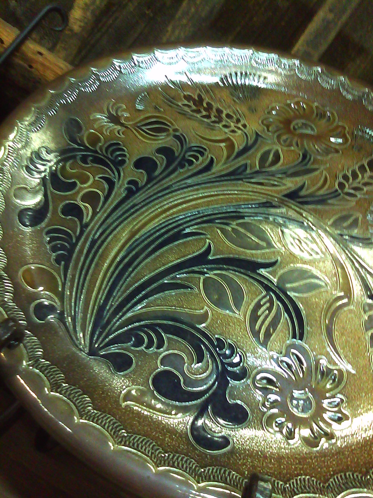
Savannah Schroll Guz, "Space-Time Continuum", 2012
(Sold 4/13/12)

Over the past few weeks, I've been so consumed with class prep, grading, and other responsibilities that I haven't had a chance to post. However, this coming Saturday will be my last two classes for the semester. Already, I have an incredible sense of relief, since I finished up my long commutes to and from Wheeling last night. After some of my experiences this semester and last semester, I will not return to my current adjuncting post. Although I enjoy teaching very much, especially to those students who care, the drama that comes with my current position is something I really want to get away from, especially since I make almost nothing. It's definitely not a living wage, and I don't get combat pay. So I've begun to seriously consider concentrating my efforts in a different direction, one that is more rewarding, even if those rewards are only personal.

On this happier note, I mentioned a project that I had begun, and once I submit my grades, I can devote more time to it. I hope to have some new things to post by next week, although I want to send them to the person with whom I am working first and get his feedback as well.

A Mercer Mayer illustration from the
the book Beauty and the Beast by Marianna Mayer
Last Wednesday night, Michael and I went into Pittsburgh to The Frick Art and Historical Center, and I took a fabulous class with Pittsburgh-based illustrator David Pohl. (See his new work here!) Until mid-May, The Frick has a wonderful exhibition, titled "Draw Me a Story", which presents the original work of book illustrators, from Kate Greenaway and Randolph Caldecott (sound familiar? He has an award named for him) to Trina Schart Hyman (one of my illustrator heroes, whose work I looked forward to seeing in Cricket Magazine when I was a little girl).

Many years ago, my Mum got me a perfect bound softcover of Beauty and the Beast. It was illustrated by Mercer Mayer, with some of the loveliest, most delicate pen and watercolor drawings I have seen. And in a period largely dominated by the Disney conception of what the two characters should look like, Mayer's Beauty and Beast are even more baroquely beautiful. I brought the book back to West Virginia from my parents' home when we visited at Easter, so I could more carefully examine every puddle of color and ink arabesque on the pages. Mercer Mayer also wrote and illustrated another of my favorite books from childhood: Just Me and My Dad.

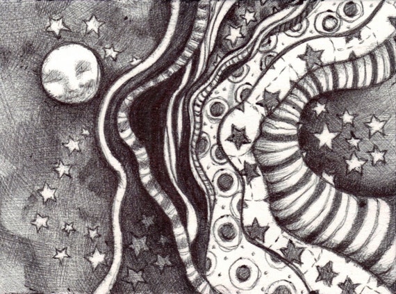
Excitingly, I've also begun selling a few items from my Etsy store. I make art pins from polymer clay that I bake and paint. Here's a piece that sold last Tuesday:
Art Pin -- Cherry Pie Slice
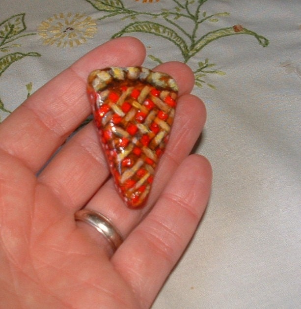
"Cherry Pie Slice" (an art pin)
Sold 4/24/12
I also sold two other items, one a small drawing (above) and another art pin that is shaped and painted like a golden butterfly. So, things are looking up in the art store. Hooray!