Showing posts with label art. Show all posts

Monday, February 11, 2013

After some time in the studio.....


"Flight Patterns" aquatint, oil pastel, black ink, cardstock, and
cotton embroidery thread


Two more works (in-progress!) from the series...more on these
to come!


The underdrawing, originally from 1999 (and quite a bit larger--I've
cut it down into four pieces like this one), is also in progress...
The stars and circular sewing machine thread pattern are new.

I've put together a binder full of my present series for an appointment I
have this week. I used Michael's comic book protectors to mount the smaller
works. 

Friday, August 10, 2012

PCA Emerging Artist of the Year

Tonight, Michael and I will be headed to the Pittsburgh Center for the Arts to see the "Artist of the Year and the Emerging Artist of the Year 2012" exhibitions. I'm especially excited to see Emerging Artist of the Year Vanessa German's work, which I first saw in Shadyside's Gallerie Chiz (on Ellsworth Avenue) back in March 2011 when I was working on a review of Peter Calaboyias's retrospective. In the two vimeo videos below, German describes the personal value of her work, that she views it as a kind of visual and spiritual language. The second video describes her process, which involves excavation and layering. More on her work after we see the show tonight. In the meantime, the videos:
Sneak Peek #3: 2012 Emerging Artist of the Year, Vanessa German: Love from PFPCA on Vimeo.
Sneak Peek #5: Emerging Artist of the Year, Vanessa German on Process from PFPCA on Vimeo.

Thursday, March 1, 2012

Publications and Pictures

First, some great news: the March 1, 2012 edition of my "Reference Short Takes" is now online at Library Journal. I'm especially excited about this because my column had previously been lumped in with all the other online reference reviews. To now have it as a separate online component, printed much as it is in the magazine itself, is really nice.

This morning, I also finished an article for American Craft (slated to run in the June/July issue) about the Society for Contemporary Craft's biennial exhibition Transformation 8. For the article, I had a chance to interview Raphael Prize winning jewelry designer Meghan Patrice Riley.

Instead of a substantial post right now, I'll save that for later, since Michael and I will be seeing the Oscar-nominated animated shorts in Pittsburgh's Harris Theatre tonight. In the meantime, some pictures:

Exhibit A: Yellow Cupcakes with Rootbeer Frosting
Mmmm....


Exhibit B: My upstairs illustration studio/home office. Drawings happen here...often.
On the window ledge is a Steve McQueen action figure. On a chest of drawers on the
other side of the room, hiding behind a potted plant, is a similarly sized GI Joe, who is
taking aim at McQueen.

Exhibit C: In the basement studio is the calla lily box.
This is the top, coated with sealer.

Exhibit D: More of the calla lily box without its drawers. Um, ha! Funny.
Apologies. I do have a childish sense of humor...frequently.


Exhibit E: 4 of the 6 calla lily box drawers, sealed with a first
coat of varnish

A new watercolor, colored pencil, and ink illustration, part of a new series.
I'm not totally excited by how it turned out, but it's part of
this autodidact's  illustration curriculum


Saturday, February 25, 2012

Sunshine, Mini-Canvases, and Guz Bees T-Shirt....

There's a more substantial update to come very soon, but in the meantime, enjoy some pictures of a new work, a shot of the morning sun inside our house, and our new beekeeper t-shirts....

Sunshine in our hallway! Isn't it beautiful?
 
Savannah Schroll Guz, "Untitled Indigo", mixed media on mini-canvas
You can see it in my shop by clicking here!

Guz Bees T-Shirt! Just shipped from Vistaprint....


Wednesday, February 22, 2012

Bridge Implosions, mini-canvases, and new works....

Yesterday, around quarter after 7 in the morning, when Michael was in the shower, I heard a tremendous rumble, one that sounded like a thunderstorm was directly overhead. The house shook, and I stopped what I was doing (wrapping items for shipment) and said, "What the heck was that?" Michael asnwered, from the shower, "It sounded like thunder." And then we realized, almost at the same time, that it was the detonation of explosives used to demolish the Fort Steuben Bridge, a bridge that has linked Ohio and the northern panhandle for 90 years. It was a demolition that made national news last night.

When I realized that the local news station had rented a helicopter to capture footage, I felt immediately cynical, thinking that it only fed people's desire to see things blow up, like a real-life Jerry Bruckheimer film. The news anchors spoke about the multiple camera angles they had planned, how their correspondents were the only ones allowed close enough to take genuinely visible footage of the destruction. I continued to think how sad this was, that it reflects how much our culture is obsessed with pyrotechnics, deafening noise, and destruction rather than nuturing quiet, sustained creation. And I think there is truth to this, on some levels. However, when Michael sent me a link to the video of the bridge imploding, I realized that there is an art to destruction. Really, I mean it: the first few seconds of the bridge destruction are visually stunning. Specifically, before the bridge exploded, an orange line of light zipped across the floor, growing brighter for an instant at each ignition point. It lasted just a few seconds, but it was a kind of performance art in a way. You can see what I mean here: Fort Steuben Bridge Implosion Videos

Illustration for "Pigeon Lover"
appearing in The Famous &
The Anonymous
(BNS, 2004)
 In other news, I'm really excited to share that I sold three Famous and Anonymous illustrations to a very nice Bakersfield, California man, who read the book. He purchased the original illustrations for the front cover, the back cover, and the chapter illustration for the story, "Pigeon Lover".

I've also been working on conceiving some new illustrations for my story about the radium girls, which I titled "The Color of Silence is Radium Green". I originally wrote the story in response to a sci-fi prompt from a journal whose name I no longer recall. And I have a very specific 'film' reel in my head for the way story plays out. I just have to determine how best to divide the moving imagery I have--what stop-motion images should I focus on to effectively tell the story? And when we focus on each of the girls, especially Doreen who is both troublemaker and victim, how does she look, down to the last detail (especially since this is historical fiction and should have some basis in fact). I see the project as a single-edition booklet, graphically executed in a palette of greens and yellows.

Also, I've gotten a double packet of these! They're little mini-cavases that come with their own easels. They're tiny, but perfect for abstract works involving vintage buttons and sparkly sequins. Oooooo....I can't wait to get started on them!

 Finally, I've been using up my spare squares and rectagles of watercolor paper, and doing my daily Zen-ritual. Obviously, it's not genuine Zen, but it is my daily kind of meditation, which I've labeled my "illustration in an hour" series. In the most recent installament, below, I've incorporated India ink, colored pencils to the usual watercolor and ballpoint pen combination. It's made a darker, more dusk-like atmosphere for the stars to shine in, but in the process, I'm getting more used to working with media, with which I was less comfortable working before. It's exciting. Here's the newest work, called "Serpent Stars":

Savannah Schroll Guz,
"Serpent Stars" (2/21/12)
India Ink, watercolor, colored
pencil, ballpoint pen

Saturday, February 18, 2012

Camille and Claude and new work....


Monet, "Camille Monet, Death Portrait"
Right now, in the evenings, I'm reading the novel, Claude & Camille by Stephanie Crowley. In the portion I'm reading, he hasn't yet Camille, but is simply finding himself as a painter, having moved away from the somewhat lucrative production of caricatures to landscape painting on a challenge from the older painter Boudin. 

I find it a terrible twist of irony that Camille--who died of virtual starvation, tuberculosis, a botched abortion, or pelvic cancer, depending on whom you ask--never got to see Monet's success or experience the cuisine at Giverny, cuisine that was filled with more sugars and fats than she had likely seen since she was a child. When I started to study art history, my Mum bought Monet's Table, which is rich with photographs of Givery's lovely yellow and blue kitchen. Its blue and white delft tiles are bright in the mid-day sun, while shafts of light gleam on copper pots. Several images show the opulent dining room table heavy under the weight of food: big, goggle-eyed fish; jellied compotes; pots of butter. I didn't think about how terribly ironic Camille's death was until I saw her death portrait (pictured above) in my college Impressionism course. I remember my art history professor saying that Monet himself explained that he couldn't help but to paint her, when he saw her lying there, enshrouded. The light and shadows on her face were too beautiful. Certainly, I understand that people grieve differently, but that statement struck me as somehow insensitive, even back then, when I was in my early 20s. Giverny and its rich cuisine was still relatively far into Monet's future, but I then began to put together the difference between his life when Camille was alive with his life after Camille's death.


Claude Monet and his first wife, Camille Doncieux
Photo credit

I never got to see Giverny when I had the chance to visit Paris, since I was there in March (of 1998) and it closes for the winter for part of each year. I'd like to back and see the gardens that are dedicated to Camille, who was Monet's principal supporter in his leanest times, who ultimately gave her life for his art.

In my own studio, a few things are brewing: 1) a label for our honey products and 2) a watercolor and ink collage, or as I like to call it, 'fun with india ink and paper'. The honey label features my husband's paternal grandfather, known by the Polish nickname for grandpa, or 'Dziadek' (pronounced, at least in our family as "Judgie"). Originally, what was at the end of the reins was a large, black horse. I had a little fun with Photoshop and replaced the draft horse with a bee. We're raisining bees on the farm now and selling honey after all! Here are the images:


Guz Bees honey bottle label, featuring Thomas Guz
a.k.a. "Dziadek" (Polish for grandpa)

Savannah Schroll Guz, "Super Nature"
watercolor, india ink, ballpoint pen, paper collage


Thursday, February 9, 2012

New work....reading The Yellow House


Savannah Schroll Guz, "The Stars Shone Above Them" (2012)
watercolor, ink, paper
Last week, I began a series of "Illustrations in an Hour", my personal form of meditation. For sixty or so minutes, I go into my office, where my drafting table is located, and I freehand a design, then watercolor it, and finally augment it with ink. My first in the series appears at left. I'm working on a second (of course now more than an hour will have gone into its production), which I began yesterday while talking on the phone. Although it might seem like placing (relative) time constraints on the time in which a piece is produced would create stress, it actually serves as a Zen moment in a day that I usually have packed full of projects. Creat lecture notes, check. Two hours for syllabus creation, check. Two hours for book reviews, check. On the exercise machine by 1 p.m. (um, yeah, I'm a bit late with that today). Anyway, this brings a little color and sparkle to my daytime schedule and allows me to descompress for sixty minutes. Now, will they sell? Eh, who knows. I put them in my shop, but I'm not truly able to move any of my works. *shrugging*

     Speaking of that particular conundrum and the ability to sympathize with another person's serious difficulty, I'm reading Martin Gayford's The Yellow House, which describes the period of time, very close to the end of Van Gogh's life, in which he lived in a small rented house in Arles with Gauguin. It was dubbed the "Yellow House" because Van Gogh had it painted that color, both inside and out, before Gauguin arrived from Brittany. Gayford's work is highly descriptive and effectively communicates the frustrations of Van Gogh's life. He was absolutely unable, despite his brother Theo's best efforts as an art dealer, to get anyone to buy his work. Theo could move Gauguin's, but not Van Gogh's, which made Van Gogh increasingly anxious and prone to self-berating. Even Cezanne, who by that time had achieved significant notoriety, looked at Van Gogh's work and declared them to have been painted by a mad man. I can just imagine how absolutely disspiriting that kind of persistent rejection would have been. Combine that with his teasing by the local children and his failure to be included in shows other than the ones he organized himself in taverns, and it seems little wonder that his mental state deteriorated to such an extent. It was not more than a year later that he cut his ear after an argument with Gauguin and gave it to a favorite prostitute named Rachel for safe keeping (not as a gift as popular legend relates). The year after that, even with a visit to the Saint Remy asylum and a move to Auvers to be treated by Dr. Gachet, he fatally shot himself in the chest. And although he was able to walk home, he suffered for 29 hours before he died. Ironically, he had been praised that year in the Mercure de France for being "a genius", but I suspect the praise came too late. He had already been hallucinating for some time and had several relapses that February.


Vincent Van Gogh, "Starry Night Over the Rhone", 1888
      His painting style changed everything, everything after him.

     He's buried in Auvers, although this was not his original burial spot--he was disinterred and relocated when someone else bought Dr. Gachet's house (which, according to legend, involved hacking away the roots of tree that firmly gripped his coffin...another interesting tale involving an almost supernatural relationship to the chemical thujone, the principal intoxicant of absinthe and carried by the tree that gripped his coffin...but that's another story for antoher time). Somewhere I have a picture of his grave and that of his brother Theo's: they are buried side by side and covered in ivy. I went there with a friend when I visited Paris on a day when, sadly, the Absinthe Museum was closed.
     Now, back to book reviews. Check.

Thursday, January 26, 2012

Oh, I've been a busy girl...

Now in my Etsy store are three new ink and watercolor illustrations....

"Jelly Beans!", 2012, ink and watercolor on Strathmore 400 series paper

"Roxy", 2012, ink and watercolor on strathmore 400 series watercolor paper

"Ralph, the Diva", 2012, ink on cardstock

Wednesday, January 11, 2012

And the RedBubble T-Shirt arrives....

"Magical Jasper" on newly arrived RedBubble T-Shirt
    So, I'm excited about the quality of the T-Shirt bearing my drawing "Magical Jasper". The print is crisp, fairly detailed, and the decal is heavy, if slightly tacky to the touch. I don't know if sticky is good or bad. I won't wash it before I wear it, though, because I've found my "Earnestly Hemming  Away" T-shirt by artist Landis Smith (it's a caricature of Papa Hemmingway sewing the hem of something frilly) is earnestly flaking away with each wash. That I'm not very happy about, and I fear what will happen to the T-shirt above after three or four washings. Michael's hybrid Mystery Machine/Star Wars mechanized thingy seems to be doing fine after an equal number of washings as my Hemmingway T-Shirt, so hopefully the flaking action is just an anomoly. We shall see.
     The "Poppybox" noted in my previous blog post will be done and ready for photographs by tomorrow. I finished the flowers, added purple glitter acrylic to the night sky, red glitter acrylic to the interior, re-attached the lefthand door, and applied a seal coat (no, not a fuzzy one; a varnish coat to 'seal' the design). Today's task, after I finish my daily quota of book reviews for my column, is to steel wool the sealing coat and then top coat it. And then, my friends, she will be ready for a photoshoot.
    What's next, you ask? So many things. I feel a table mermaid coming on, for one. I'll explain more later....

Friday, January 6, 2012

In the Studio Today: Poppy Box

This year for my part of my brother-in-law Glenn's Christmas gift, I painted a shelf with bees and poppies (since he, Michael, and I are beekeepers). I made it a manly dark blue, and it eventually became a night scene with stars and a moon (although I know that bees stick around their hive at night). Anyway, I liked the effect of the red against the indigo so much that I began working on another piece for the Etsy store. Eh, voila! "Poppy Box" (Now, the box does have two doors; I just have one off temporarily. Also, it's not done just yet--this is a progress picture...the center of each flower needs to completed).

Front, "Poppy Box" (in progress, without one door)


Back, "Poppy Box" (in progress)


Tuesday, December 20, 2011

On Red Bubble, my Drawings on T-Shirts and hoodies....

This morning, I opened a store on RedBubble, a site that caters to artists who seek to sell their work on T-Shirts, hoodies, and as stickers and iPhone covers. I know their T-shirts are very high quality, since I just bought T-shirts by two other artists for Michael and myself. The printed decal of each drawing is high resolution and substantially thick, so it will not fade with washings. Additionally, the T-Shirt is of equally excellent quality. Farbic tags, offering details about Red Bubble's mission and the artist, come clipped to the shirt tag by a tiny wooden clothes pin. How ingenious is that?  
As I continue to complete drawings (which will happen more quickly as I complete Christmas gifts here) my store offerings will continue to grow. The image originals are available in my Etsy art store.

Tuesday, December 6, 2011

Jane Priser and Magical Jasper...


Jane Priser, "Alien Face, Tricolor"

Etsy continues to be an amazing place for me, a hub of like-minded people doing inspiring things. Since I started creating artwork in earnest for the Literary Outlaw store earlier this year, I've 'met' and discovered atists doing some genuinely stunning work. Colorado-based artist Jane Priser is one of those people. Her polymer clay masks, with the haunting, often color-saturated eyes are, at least to my mind, somewhat like reading an A.S. Byatt novel....remember the description of the seance-conjured angel in the two-novella work, Angels and Insects? Or the description of Maud Bailey's flat in Possession? Well, like that. I am completely smitten by Priser's otherwordly beings, which seem to have depth and intelligence in those unblinking gazes.

For my part, I've been doing assemblages in cigar boxes. I've also been making illustrations, like "Magical Jasper", which is supposed to be a hybrid of our dog, of course named Jasper...only with a scaly backbone and fly-away hair (heh, like the hair doesn't fly away on its own in our house...I get out the vacuum one each day precisely because of that). Now, there is something about drawing with a ball point pen that is not unlike meditation for me. It's almost like automatic writing, and somewhat more restful that painting, although I enjoy that, too. Except, except...painting involves a certain level of anxiety. See, painting can sometimes get away from me, and I have to steer it back to a workable format, an aesthetically pleasing product, which sometimes involves reverting to safe imagery. What does that mean? It means, imagery that I've succeeded with before. With ballpoint pen (a good smooth flowing ballpoint), I'm pretty much free to do as I like, and I'm glad for that. I enjoy, too, making and developing the arabesque, nuturing the wisp into three-dimensional believability with the fantastic power of cross-hatched shaing....and then there are the eyes. The muscles of the iris, the diameter of the pupil, all totally absorbing to articulate in ink. Am I an art geek? Well, yes, I'm afraid so.


Savannah Schroll Guz, "Magical Jasper" (2011), ink on paper

Friday, October 28, 2011

Artist James Ward (a.k.a. Jimbo Art)

James Ward, "Bird of Paradise" (Serving Plate)
See the Etsy Listing here
Etsy, I have found, consistently showcases some fantastic artists. For example, I've been following the shop of British artist James Ward for at least a year. While he does works on paper, like the watercolor-drawing below, a bulk of his production for Etsy involves hand-drawn ceramics featuring anthropomorphic animals. In his profile statement, he indicates that he likes to create narratives within his images, although he admits they are ambiguous and, I would add, elliptical.You can't necessarily determine what has happened before the 'captured' image or what might happen afterwards.Still, the viewer knows there is some humorous or deeper interaction happening, and this is the heart of Ward'swit.  

The artist's attention to detail is similarly stunning. Take, for instance, his hand-drawn wolf serving plate. The fur has texture and volume; the eyes hold depth and expression.

And of course, there is Ward's attention to brief verbal narratives, which often accompany his listings. I quote the description that accompanies "Goat Puppet":
James Ward, "Goat Puppet"
Viewthe Etsy listing here

"Ralph began his puppetry career in the late ‘80s following a brief sojourn in burlesque dancing. He regularly performs a range of puppetry and mime in underground clubs. His work, often taking a political bent, is heavily inspired by Dadaist theories. He dreams of taking his act to London’s West End and to Broadway." -- James Ward
Brilliant, no? I think so.


Wednesday, October 26, 2011

And in the studio....


Yesterday, very happily, I sold the pin just above
in one of my Etsy shops. It's a lime slice made of baked
polymer clay, painted with acrylics,
and protected with varnish.
The rind says: "Destined for...gin!"

Since it's getting close to the Christmas shopping season, I made
these three handpainted pendants this morning.
I'm letting the protective top coat and epoxy resin dry.
Next, I'll fit them with ribbons and clasps and they'll be ready to go
into the shop.

And here they are with bubble chains. Swankness.

Wednesday, July 13, 2011

Things I understand with age

George Grosz at work
During my year in Germany, when I studied in an antiquated building whose most memorable feature was its herringbone parquet floors, I spent a lot of time in the Art History Department's library. I pulled out tomes, translated chapters, and made copies enough to fill several three-ring binders, which I eventually shipped home via the now defunct "Seepost". All of this activity got me closer to learning who George Grosz really was.

Of course, I knew who he was. His drawing, "Fit for Active Service", had been in my mother's college text, H.H. Arnason's History of Modern Art, along with a color plate of the painting, "Pillars of Society." (Arnason's book became something close to a sacred volume for me. I look at it constantly. I once knew the order of the page imagery by heart.) And yet, I did not understand what made Grosz, the man, tick. I felt this was necessary, since I had chosen him as the subject of my thesis. During my first few months at LMU, I made an appointment with a professor in Art History Department and indicated, in my then uncertain German that I wanted to study Max Beckmann. She said, "You will find it difficult to do any original research on Beckman. So many people have already written about him. Why don't you do your paper on someone like...oh, say, George Grosz?"

Why not, indeed. The previous year, I had deferred my Master's Degree at Pitt in order to come to Germany, and I had already met with my future thesis advisor. She was a George Grosz scholar, perhaps one of the most prominent Grosz scholars. I had no misgivings about entering her turf, although some fellow graduate students later questioned my sanity. When I returned home, she and I carved up Grosz' life like it was steak. She got the 19-teens, 20s and early 30s; I got his emigree legacy. And ultimately, I tied Grosz's legacy to another artist, Romare Bearden, Grosz's student at the Arts Students League. But that's another story for another time.

So, the first Grosz I got to know was the Grosz of Second Reich and Weimar-era Germany--the Grosz whose manifestos I read in my apartment at Moosacherstrasse 81. Here was the Grosz of Dada, of Neue Sachlickeit, the Grosz who spent time with John Heartfield and wrote disgustingly boastful journal entries about his sexual exploits with girlfriend (and later, wife) Eva. Also, I got to know the slightly older Grosz who had a sincere commitment to Communism until he saw its realities in Russia. And then there was the Grosz of the blasphemy trials.

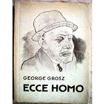
Here, as an aside, I should probably mention that before the story collection American Soma took the name of the principal story (a decision James made, and I don't disgree with), the collection was called Behold! Mankind. Why? Because it is the rough translation of George Grosz's portfolio satirizing mankind's immorality. (I intended no allusion to either Pilate or Nietzsche, only Grosz.)  Ecce Homo, published by Malik Verlag in 1923, was what landed Grosz in trouble with the authorities and, eventually, in court. Because American Soma offered small portraits of man's weaknesses, I felt there was a parallel in spirit and message.  (Also, if you read the story "Movie Star" in my first book, The Famous and The Anonymous, George Grosz appears as a character. I try to fit him into each fiction compilation because Grosz is my literary version of 'Nina'.)
George Grosz, "The Retreat" 1946
Back when I was in Munich, I was young (22 and then 23), determined, not easily daunted. I drank alot, and I saw in Grosz the nihilst, the rabble-rouser, the person who stirred dissent because he was young and prone to rebellion. I recognized a little of myself. 

When I got back to America, I began to discover a different Grosz, a disillusioned man, whose attempts to get away from his highly politicized past were met with criticism. Malcolm Cowley, who reviewed an exhibition of Grosz's American paintings for The Nation in the 1940s, castigated the artist for his decidedly apolitical tenor, for his tepid Cape Cod sand dunes, his comparatively academic nudes. Where, Cowley wanted to know, was the satirist? He was needed now more than ever. Apart from a few images representing the "haves" and the "have nots", Grosz abandoned social issues. 

I couldn't see it when I was 23 and 24, but I understand at 37 that Grosz was a haunted man, a broken man, as evinced by paintings like "The Retreat" of 1946. And knowing about the prescient dream he had in late 1932 that caused him to pack up his home and family and flee Germany before Hitler ascended to the position of Reichschancelor in 1933, it's easy to understand his pessimism. He had already seen that, ultimately, Stalin was little different than Hitler, something he revealed in a drawing appearing in the 1936 portfolio Interregnum. Ultimately, he resigned himself to the realization that man was so bogged down by weakness, desire, and corruption that he could never hope to achieve an equitable social or political system.

Malcolm Cowley, who castigated Grosz for
the artist's apoliticism in America
Why Cowley could not appreciate this, I'm not sure. Perhaps he was himself still an idealist. Perhaps he felt a man could not, or should not change. Grosz's attention to aesthetics over content was a conscious turn away from that which he knew could not be fixed. No amount of propaganda or artistic dissent would change the fundamental, corruptible nature of man. Ecce Homo indeed. Here, it seems, is the disappointing truth about man. Grosz knew this, and it is, I would wager, what contributed to his heavy drinking and, ultimately, his drink-related death.

Thursday, May 12, 2011

In City Paper, a Review of Sung Rok Choi's "Call of Duty: Operation 100"

Running this week in Pittsburgh City Paper is my review of the artist Sung Rok Choi's exhibition, Call of Duty: Operation 100, currently on display at the Pittsburgh Center for the Arts.

Sung Rok Choi, "Call of Duty: Seaweed" (2011)
Photo credit: sungrokchoi.com
Here's a small excerpt:

"The Brechtian quality of these naïve depictions points up our conditioned expectations: Where is the impersonal, unfailingly heroic aura assigned to soldiers in recruitment and propaganda videos? There, physical prowess and valor eclipse any sense of individual experience. Here, Choi offers a view of the disillusioned individual. Considering South Korea's compulsory two-year conscriptions, this is likely closer to many men's understanding of 'duty.'"

Read the whole review here:
"A Korean artist's riff on Call of Duty asks us to reflect on warfare"

Wednesday, February 16, 2011

Making stuff Again

The girl, she is back in the game, making things...and talking about herself in the third person. *tsk, tsk, tsk*   C'est ca, built from an old etching:

"Conjugal Lizard" 2011
Music for this moment? Try this:

Friday, October 29, 2010

Carnegie Museum of Art Begins Open Dialogue and Exciting Revision

True to its new spirit of transparency, The Carnegie Museum of Art offered a behind-the-scenes glimpse of exhibition production, and its many complexities, on Thursday, October 28th. The presentation, which involved Carnegie MuseumDirector Lynn Zelevansky, Curator of Education Marilyn Russell, and Associate Curator of Contemporary Art Dan Byers, described the process of conceptualizing exhibitions and making these abstract ideas work within designated spaces. It is a process driven by creativity and educational objectives but subject to the demands of budgets and allocations.

Last night’s panel was the second installment in a three-part lecture series concluding next Thursday, 4 November 2010. This final presentation will explore the relationship between museums and living artists. The panel will feature Pittsburgh photographer Duane Michals.

While the entire presentation was illuminating, offering insight into the many people involved in exhibition production, perhaps the most fascinating idea came early in the conversation. The idea dealt with the role of the art museum as storyteller. And this idea in itself is not new. Certainly, museums, which make the sometimes inaccessible and otherwise untold open to the widest audience possible, are always storytelling, educating, interpreting. Yet, it was Director Zelevansky’s addition of the tacit adjective ‘revisionist’ that was thrilling. So, by this implication, the Carnegie Art Museum has indicated that it is willing to both advance and alter (by means of expansion) the traditional art historical narrative.

What does this mean, you ask?

Art history (as an academic focus, especially) generally offers a very linear interpretation of the art world and its many currents. This “story of art,” found in every survey book (whether chronologically broad or limited) has a tendency to flatten complexities. Once petrified by too-frequent telling, the story becomes solid but incomplete, ultimately offering a limited perspective. With the same tale retold for generations, the heterogenic intricacies of every period (along with many significant, if under-recognized artists) are lost, perhaps forever. Moreover, in the traditional story of art, certain artistic agendas are advanced above others. Frequently, these long-standing inclusions still appear because of antiquated selection criteria. A perfect example is the history of art that largely omitted women painters and sculptors. This old-garde version of art history is still being mended by today’s revisionists, and sadly, there is still a kind of segregation of women artists from the broader historical timeline.

Yet, this notion that art museums can rewrite art history, even perhaps undo past wrongs, is exciting, forward-thinking, hopeful.


In 1996, when I worked the phones as an intern in the National Gallery’s (NGA) then 20th Century Department, I realized that there was a great deal of hatred leveled against large institutions by artists themselves. One artist repeatedly phoned the department from the guard’s desk downstairs and railed against me because I was unable to connect him with a curator. “Why,” he asked, “do you only ever show dead artists? So many of us are living and making things now.” He seemed to press the receiver closer to his lips. “Your museum,” he continued somewhat ominously, “is as dead as your artists are.”

His anger, of course, stemmed from the fact that he felt ignored by the mainstream. And it wasn’t entirely true that we featured only dead artists. We had many works by living artists, but I understood his point. To him, these artists were not a vital part of the culture of the now, of 1996 or the nineties at all. Those artists had already achieved notoriety. NGA was, in his eyes, merely repeating sins of omission, looking backward, repeating what was already known. When I naively suggested he try at one of the local galleries, he slammed the receiver into the cradle. This was not what he wanted to hear, and I had not meant to be condescending, only helpful. I felt for him. At the time, I was an artist, too, struggling to find a place for my work.


Did I think that the NGA was the appropriate place for him? No. The NGA was tasked with offering retrospective looks at art—art on which we had the appropriate amount of time for reflection. Do we truly know something’s value immediately? Sometimes we do, but more often, it takes a careful backwards gaze to understand a definitive artistic moment and properly assess its value to the story of us, as people or as the dominant sentiment of national culture.

Still, many artists see larger institutions as part of the problem with the art world. The museums, they insist, have it all wrong. It’s so one-sided, focusing on those people who have ‘made’ it, those who have already enjoyed plenty of attention in their greatest periods of productivity. So, what, these forgotten or ignored artists ask, are we any less representative of our time than those who have been taken up by the art historical narrative?

It’s a question that artist Paul Thek likely asked in his later years of productivity, when he, too, felt forgotten. Carnegie Museum Director Lynn Zelevansky--who made the initial indication that she intends to make the Carnegie a place that expands the traditional narrative, pushing its conventional boundaries, figuring out how some artists are relegated to the margins while others are largely celebrated—has worked to redress Thek’s previously unacknowledged plea. Her retrospective, co-curated with the Whitney’s Elizabeth Sussman, is titled Paul Thek: Diver, and is currently on display at the Whitney and coming to Carnegie Museum of Art in 2011.

More to come on Paul Thek and the exhibition in a future post.
(Photo of Paul Thek, above left, by Peter Hujar)


Wednesday, May 5, 2010

Some General Reflections on Good Stuff

Arriving in my mailbox yesterday was The Last Game We Played by Jo Neace Krause, who won Black Lawrence Press' Hudson Prize for the collection in 2008. I greedily unwrapped it, since I've been looking forward to its arrival, although it got here very quickly.

I saw that Joyce Carol Oates blurbed the book, calling the stories "strange and compelling." Since, as you may know, I am a fairly rabid Joyce Carol Oates fan, I was eager to see the work of an author whose writing Oates' endorses, especially since the words Oates uses to describe Krause's short stories are exactly those I would employ to characterize Oates'. After class last night, I was able to start one of the book's 12 stories. "Disgust," a title that intrigued me, has the delightfully salty flavor of Flannery O'Connor and certainly touches some of O'Connor's subject matter, since it involves a young Jesuit priest and his eternally sherry-dampened mother, a benefactress who takes in wayward girls so they might escape the detention center. And although there were clues at the outset that the rescued girl is not on the path to redemption, you want to believe she is good, that she is trying. You find fault with her employer, who is easily affronted, fond of her position, condescending to the last. And the girl, so very aware of this, is rotten to her very core. Still, this is not what inspires disgust...not at all....we shall discuss this all later, in another post. So good! I'm excited to get to the next one...

In the meantime, it's interesting to note that Krause is also a painter, whose work is featured in the Kentucky Folk Art Museum. The work at right, "The Death of Stonewall Jackson", previously appeared at storySouth . The cover of her collection, too, contains a nude she herself painted. If you will kindly permit me to get my art history geek on, I'll be happy to inform you that, in the painting above, I see echoes of Marc Chagall, Paul Gauguin, and Henri Rousseau. (You get a gold star, Savannah. )

Yes, that was nice, but I'll put my geek away now. Still, it might come out again. The velcro on my geek keeper is loose.

Speaking of the fallen young woman in Krause's story "Disgust", I'm also reading Nana and enjoying it much more than I did when I started it in grad school, a time during which I was oriented more towards the louder, fully mechanized Futurism of the 1920s, towards Weimar, towards Otto Dix's lecherous walking cadavers, and Max Beckman's sadistic , symbol-studded triptychs. The apparently innocent, dimpled flesh of Renoir's women or Manet's provocative, Salon-splitting nudes of Victorine Meurant seemed less enticing to me somehow, and so too the era's literature. But I'm getting older. I don't know what that means, really. But I fulminate less, and prefer my artwork to do the same. As an aside, I think the gentle graces of Renoir are more fitting for the young courtesans than any of the other Impressionists, whereas I associate the more hardened street strollers with Toulouse-Lautrec.

For example: below, T-L apparently captured this lovely lass just after a particularly difficult transaction...or maybe as she anticipates one.

Sure, she'll drink to that. You buying? If not, it's okay. She already has the bottle.

Of course, I always knew there was a hierarchy among the mid-19th century good-time girls, but I just didn't know the particulars, or I have simply forgotten them over time...although I have always known who could occasionally be welcomed (grudgingly, of course) into salon society and who would be eternally barred. That one's a no-brainer.

I use Thomas Hardy's "The Ruined Maid" in my literature classes, so I'll now be able to provide specific examples (Well, thanks, Mr. Zola) that demonstrate the difference between the 'kept' courtesan and the lowly street walker, whose dry spells left them dipping their fingers into sugar bowls for sustenance or eating the remnants of meals left by others...but this happened only if the owner kindly turned a blind eye.

Back to Hardy and 'Melia: her bleak reality is most evident in Nana. On her way to becoming a true courtesan, Nana, who apparently started on the street, must make home visits to interested parties, who make their inquiries through a kind of 'work broker' (in reality, she's a dowager doubling as a pimp). Passages from Nana will certainly help to illustrate how dim the future is for such women, who may never have the wit to climb to higher levels and place themselves in positions affording them self empowerment and long-term security. Without these, they eventually become social discards as soon as they burn through the single commodity they have: their youthful body.

I was struck, even as I continue to read, how many intersections there are between Nana's life and Anna Nicole's...a baby boy kept by family, an tendency towards extreme petulance, beauty (according to the standards of the day), and intermittantly brilliant flashes of luck....even the names, if the letters were rearranged, are eerily similar. Things to ponder....things to ponder....

Anyway...those, kids, are today's thoughts....more to come tomorrow, especially since I plan to get back to the fractured/micro fiction discussion! Lots of great conversation on HTML Giant last night.